Bongo Focus
Bongo Focus is a platform that collects insights drawn from dynamic interactions between friends and colleagues.
OVERVIEW
Bongo Focus is a product of Bongo Media, founded by Pulitzer Prize-winning journalist and author Ron Suskind and backed by a team of experts. Focus is a technology platform that replicates the intimacies of human connection to generate unique perspectives on people, products, and events. On BongoFocus, friends and colleagues can share their true thoughts and opinions with one another.
During the Covid-19 crisis, our platform has evolved to focus on Doctors and Journalists working at the height of the pandemic. Doctors are Covid’s first historians. This B2B platform is a tool for employers to get real insights from their employees. Pairs of participants enter the platform and answer guided questions. Their faces and voices are anonymized and analyzed, creating genuine insights and stories from a moment in history. Hospitals such as New York Presbyterian and Massachusetts General Hospital have used our platform to get honest insights from their doctors. It serves both as an internal human resource tool and a storytelling tool.
I joined Bongo as a Product Designer. The technology worked but the platform had not been designed. I took a skeleton version of the product and transformed it into a high fidelity, user-friendly platform.
THE DESIGN CHALLENGE
How can we redesign Bongo Focus for Doctors and Journalists working at the height of the Pandemic?
THE PERSONAS
Dr. Kelly Griffin
Doctor at the NY Presbyterian hospital, working at the height of the Covid-19 crisis.
Age: 35+
Comfortability with Technology: High
“I saw six patients last night who wouldn’t make it and I had nothing to offer them.
Dr. Lindsay Leif
Doctor at the NY Presbyterian hospital, working at the height of the Covid-19 crisis.
Age: 50+
Comfortability with Technology: Medium
“How am I doing? Well, it’s day 45 so I’m tired. How do I look?
Need, Assumptions, Goals and Constraints
Previous Platform
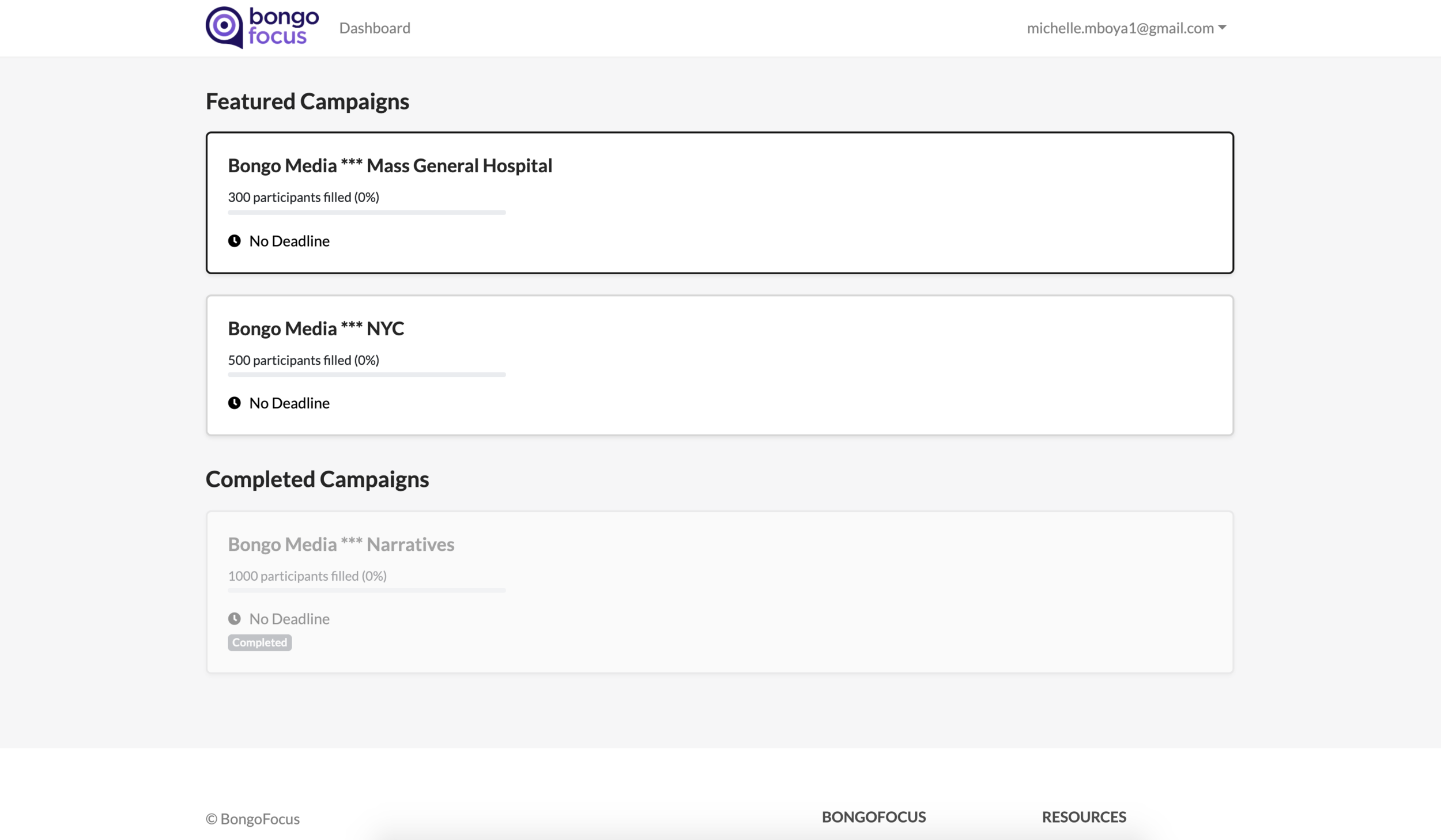
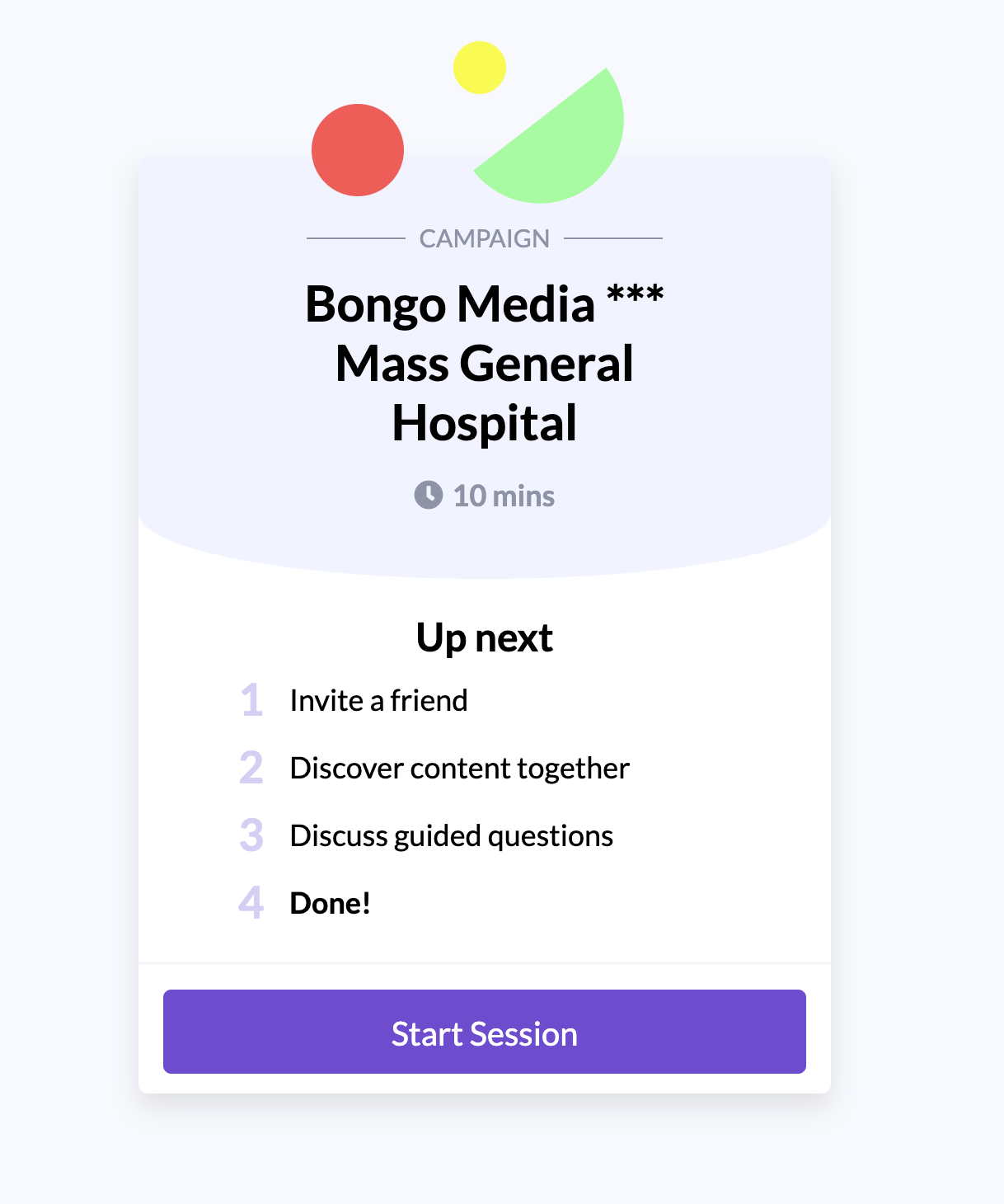
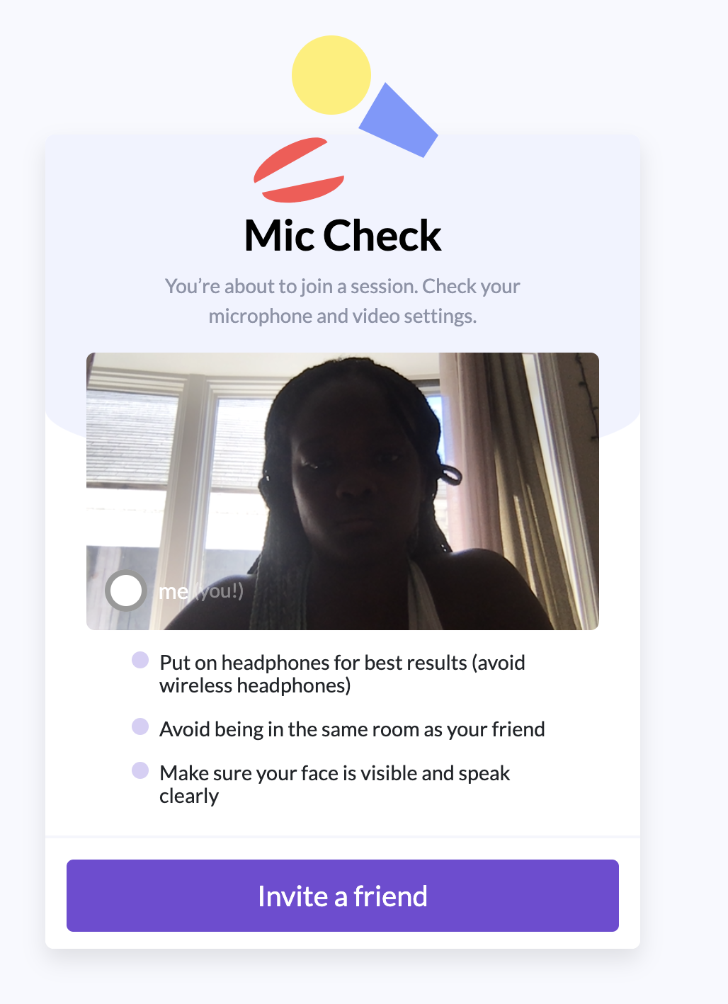
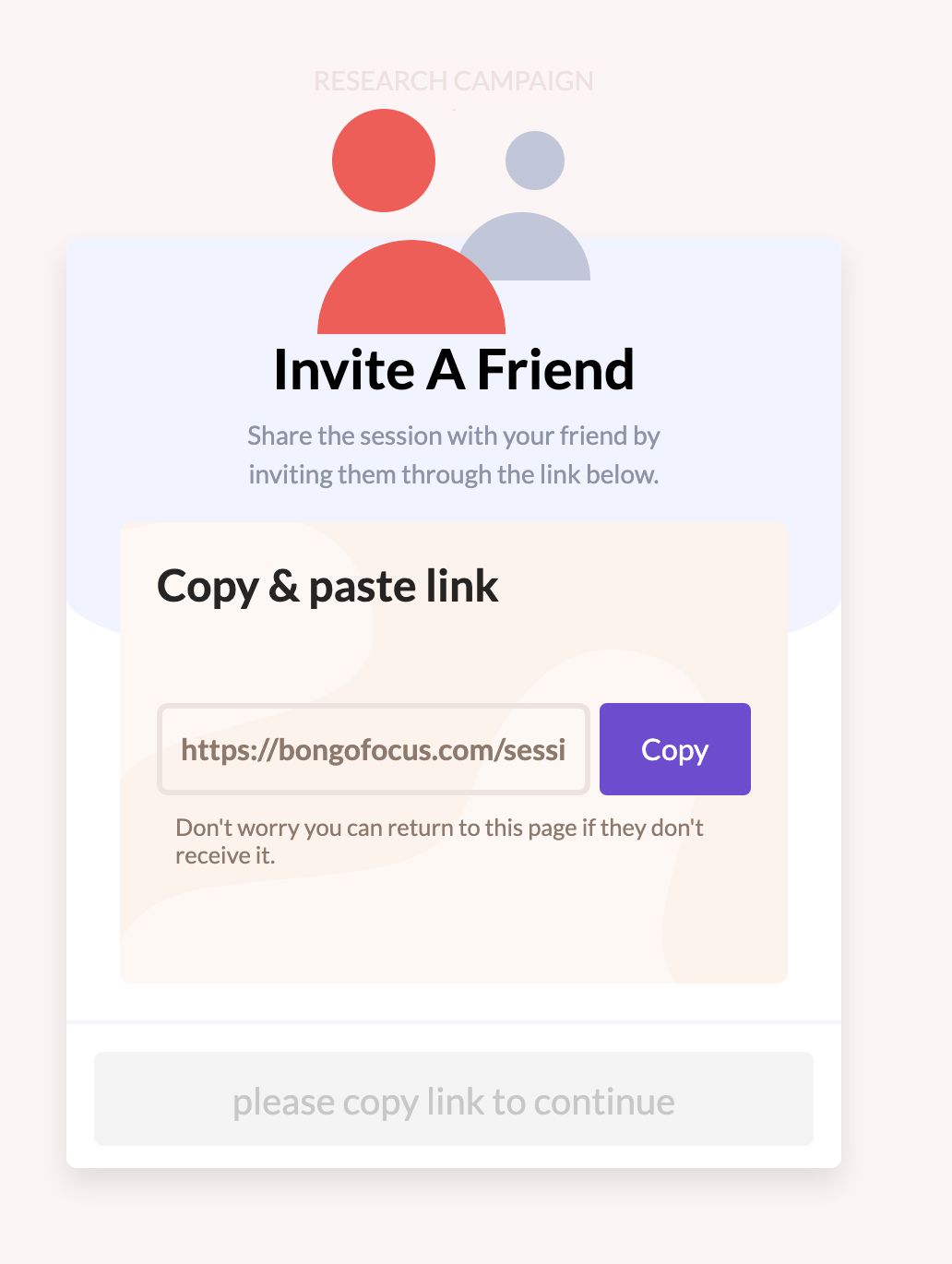
This is an overview of the web platform before I joined the company. While it was functional, it was in need of a fresh coat of paint.
Key Features
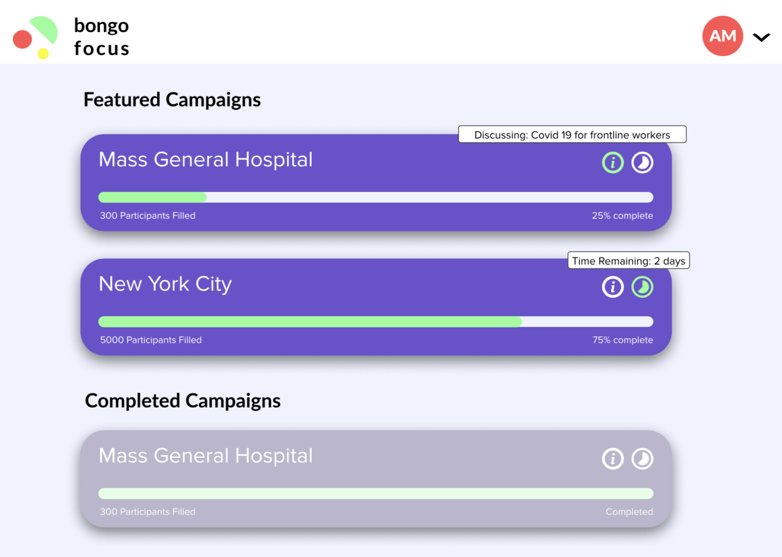
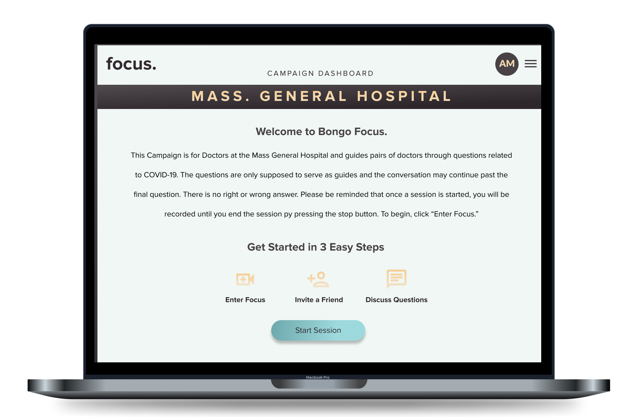
A landing page or “Dashboard” with information about the participant’s campaign.
An overview of how to use the platform and get started
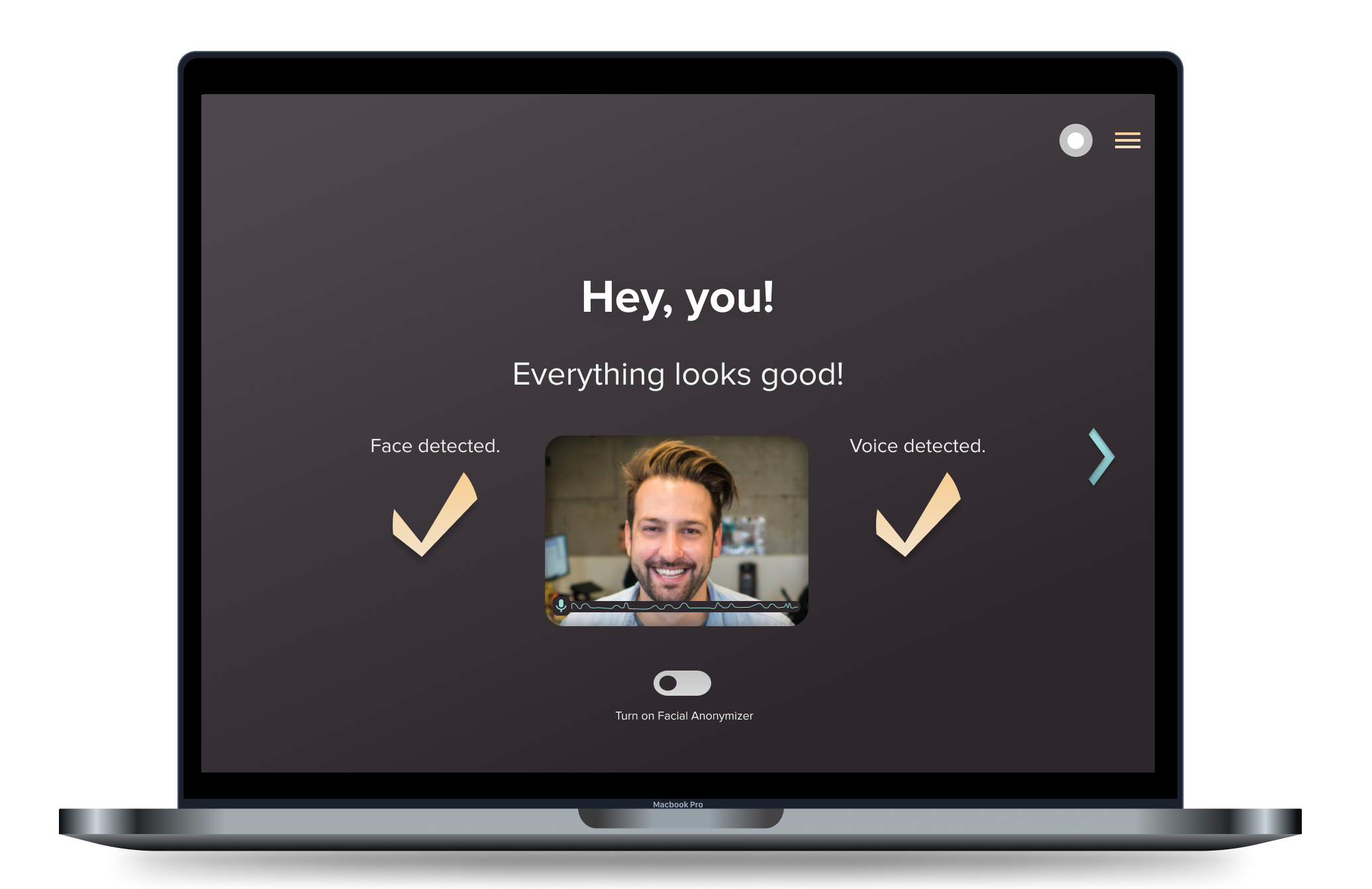
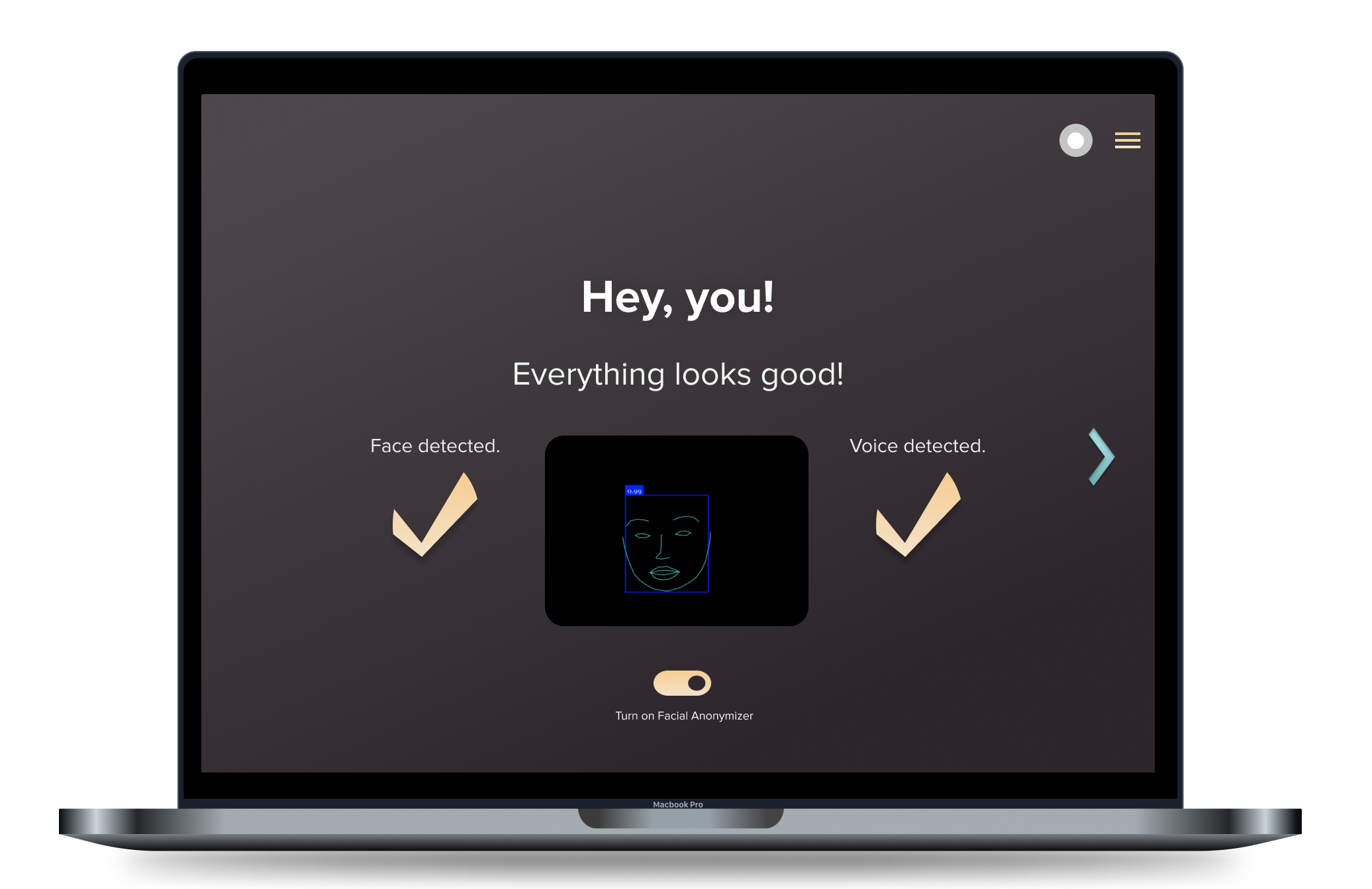
A mic and camera check
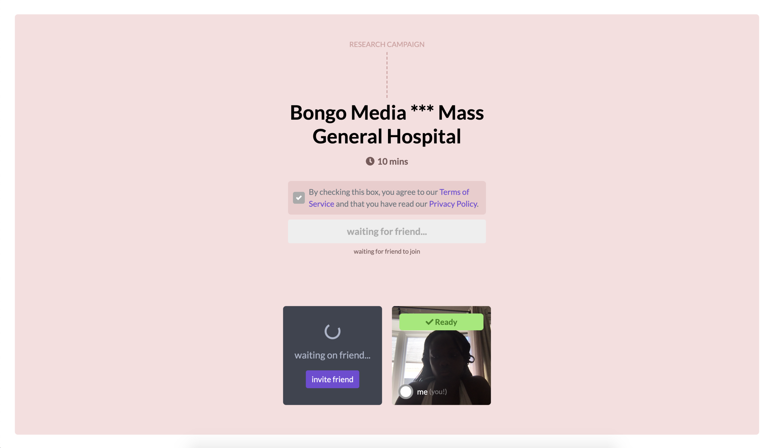
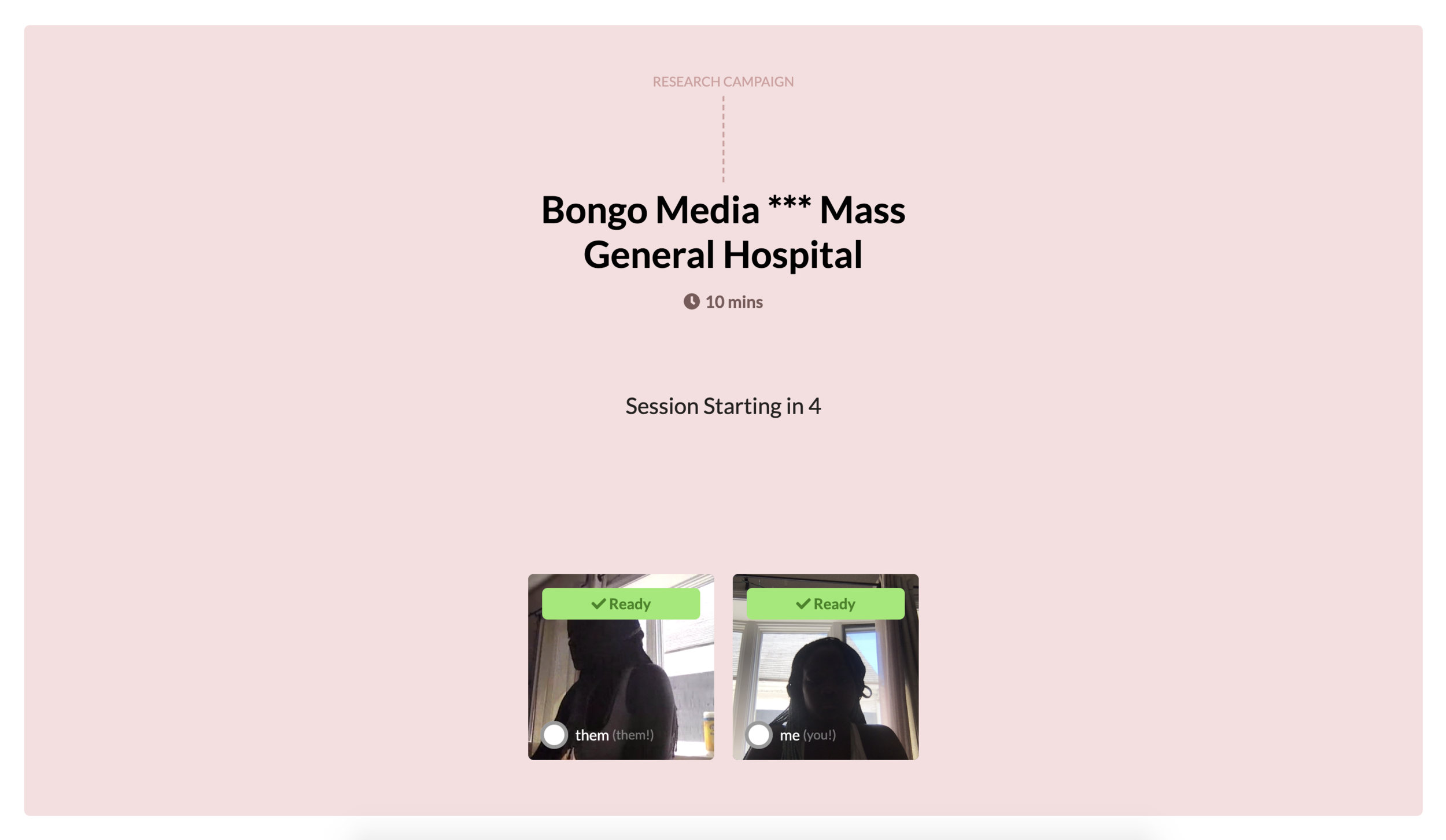
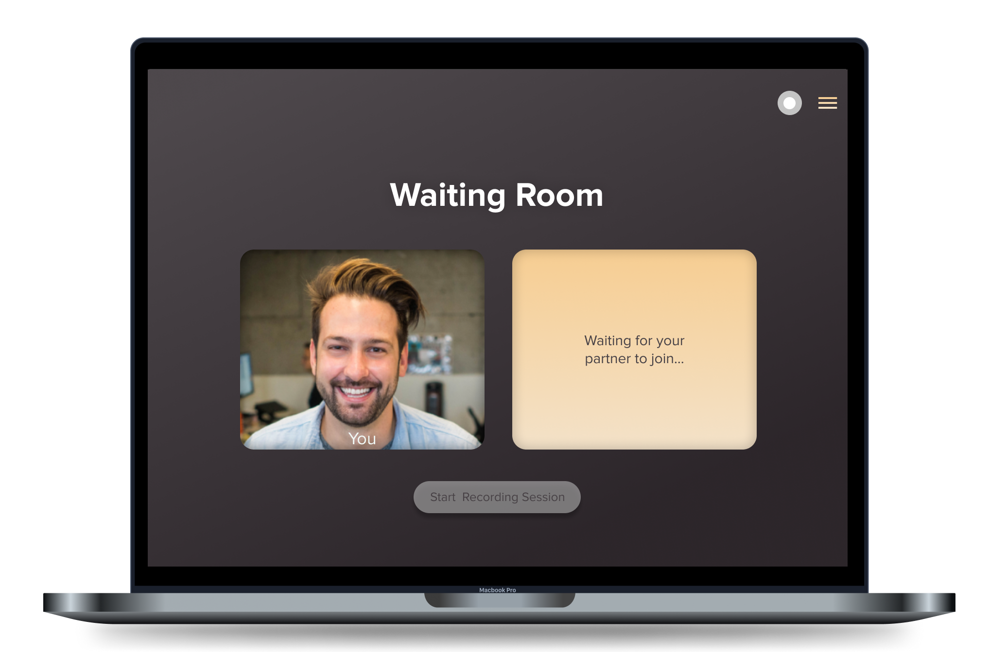
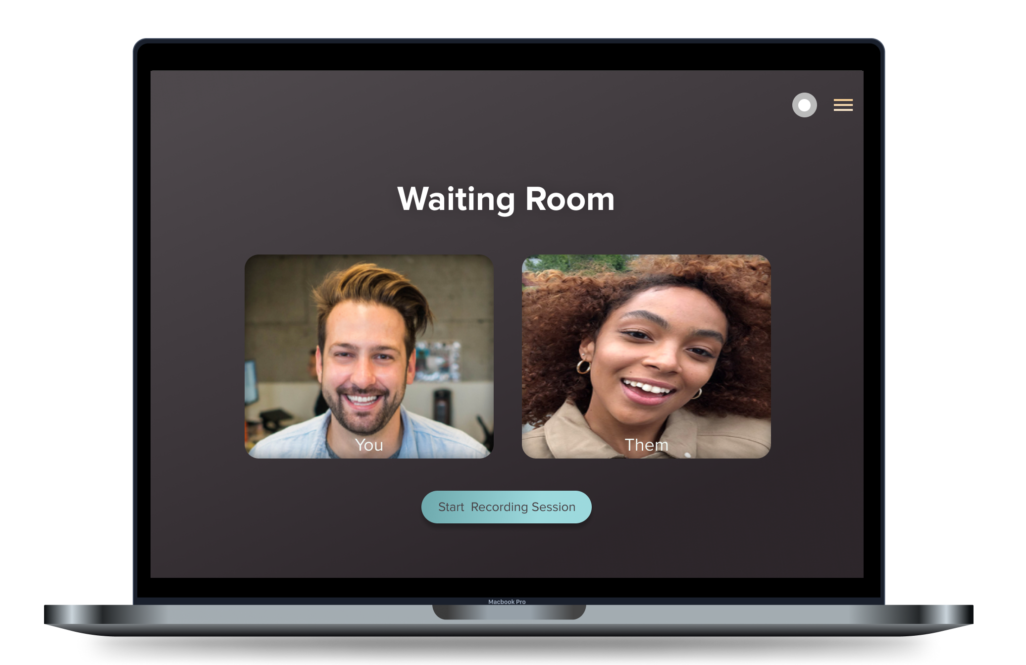
A waiting room to ensure both participants are present
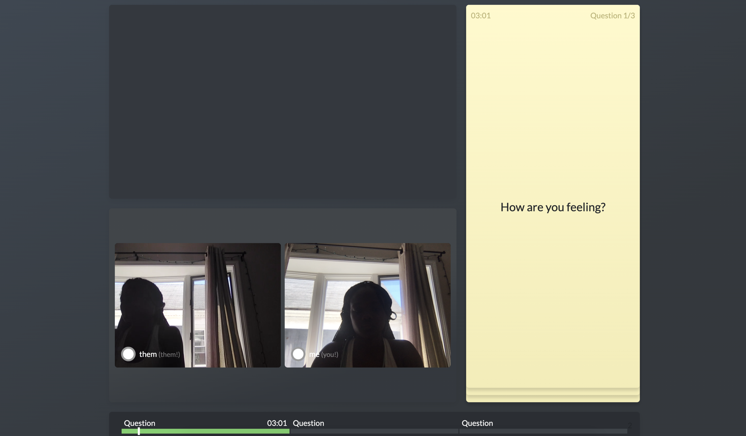
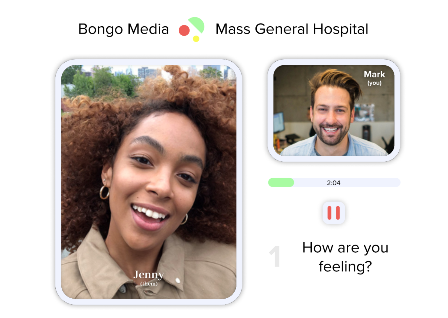
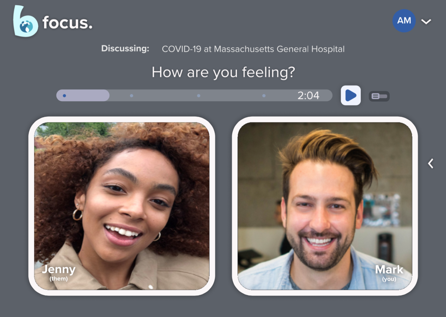
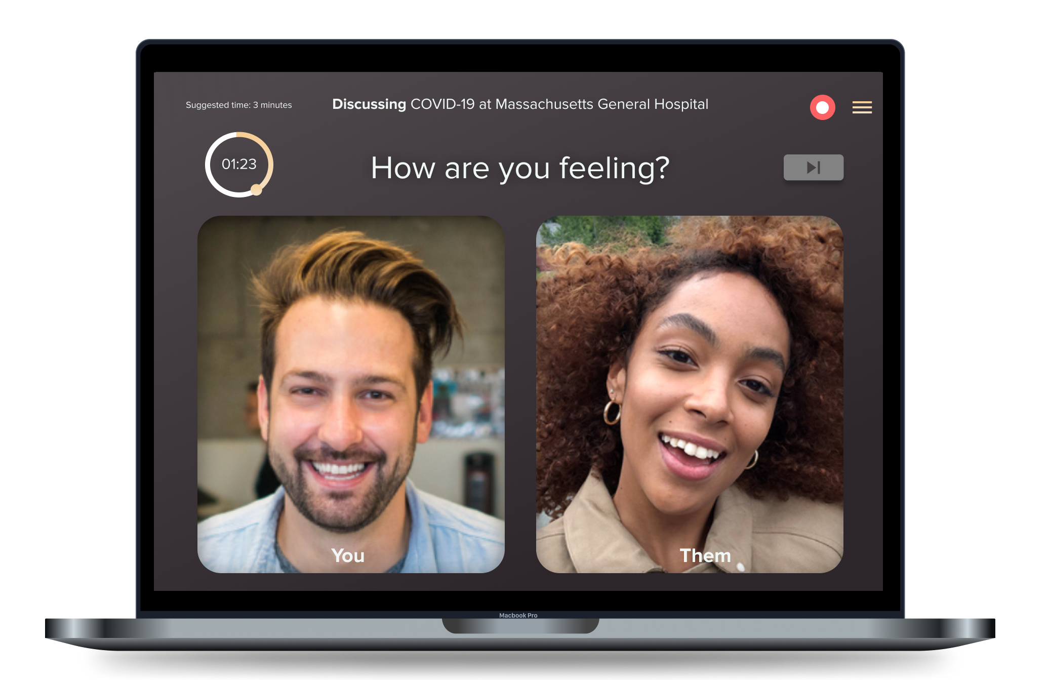
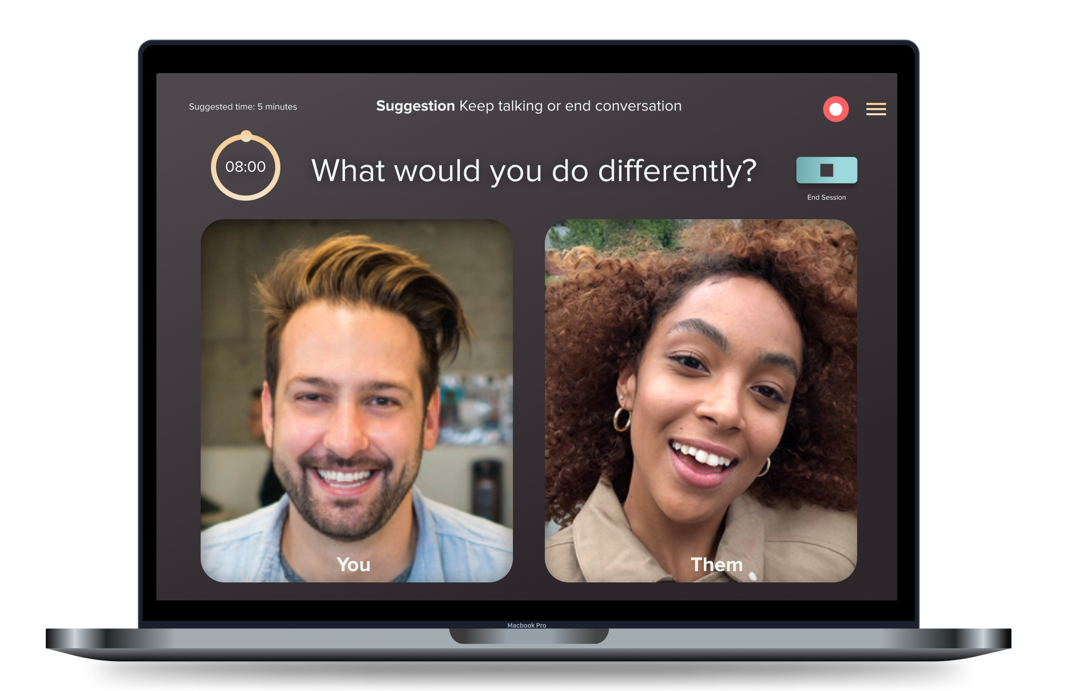
Questions displayed to guide participants through the platform
A timer to help guide participants.
Early Designs: Initial Concepts
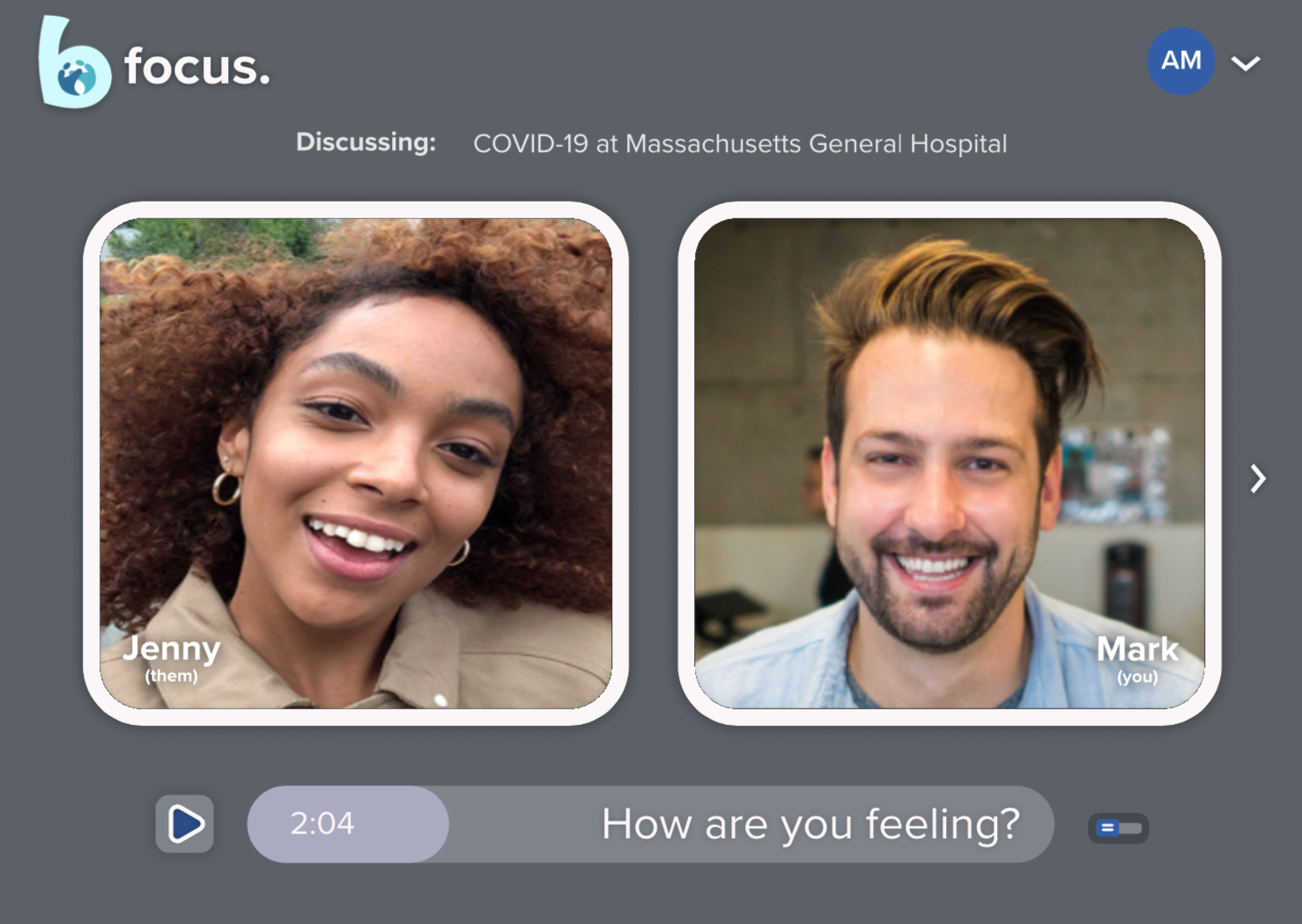
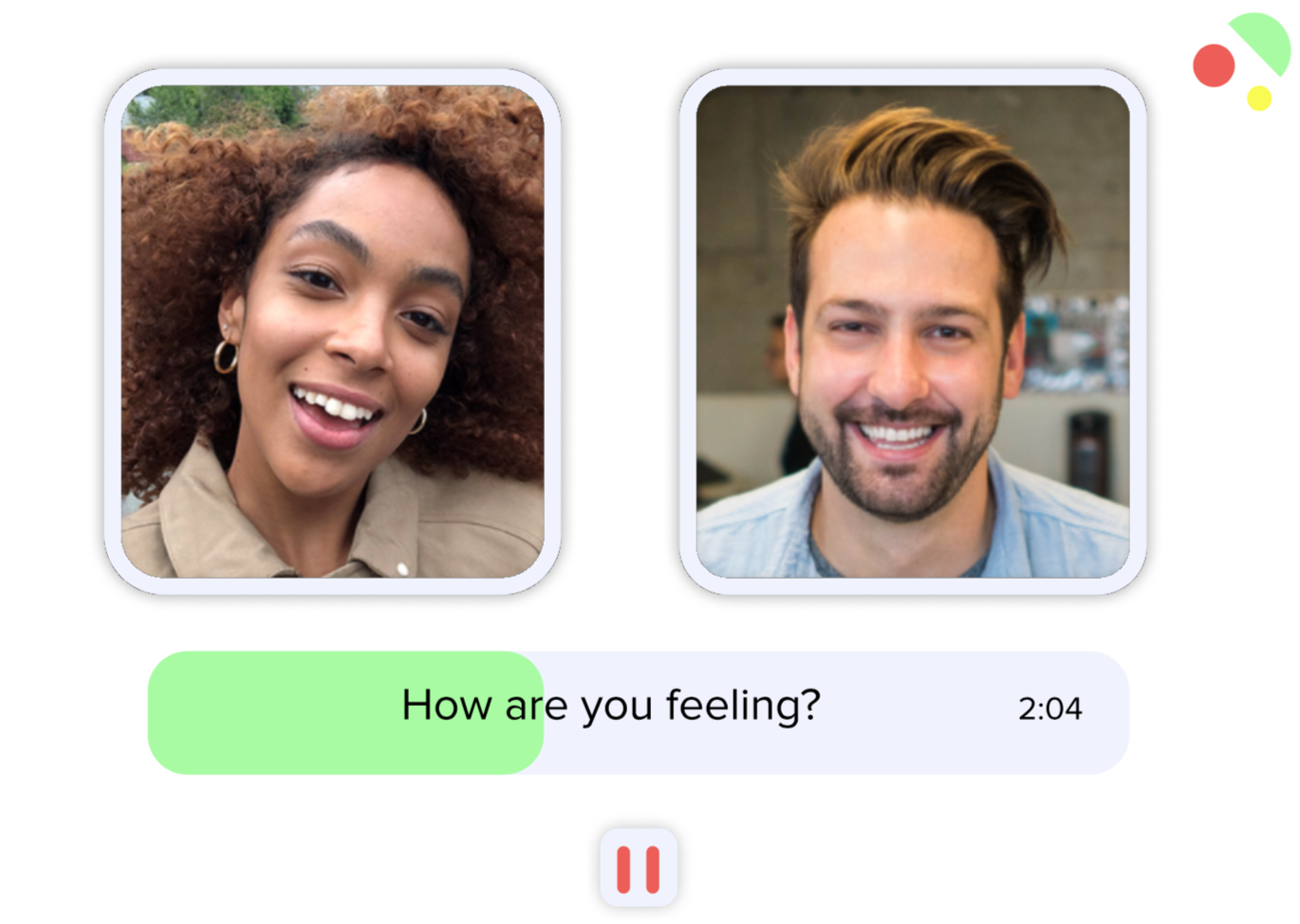
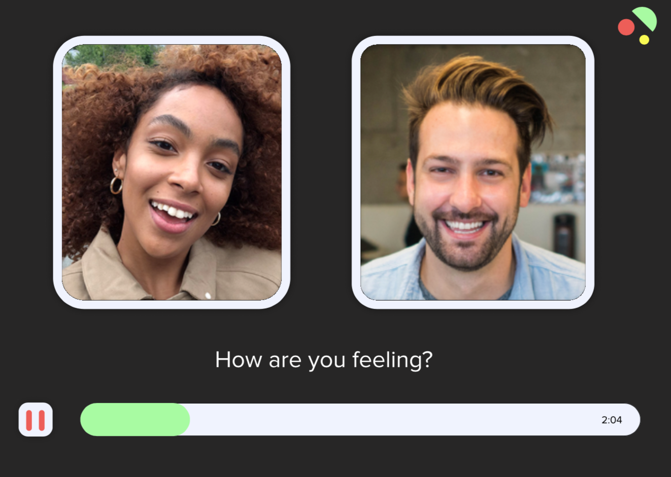
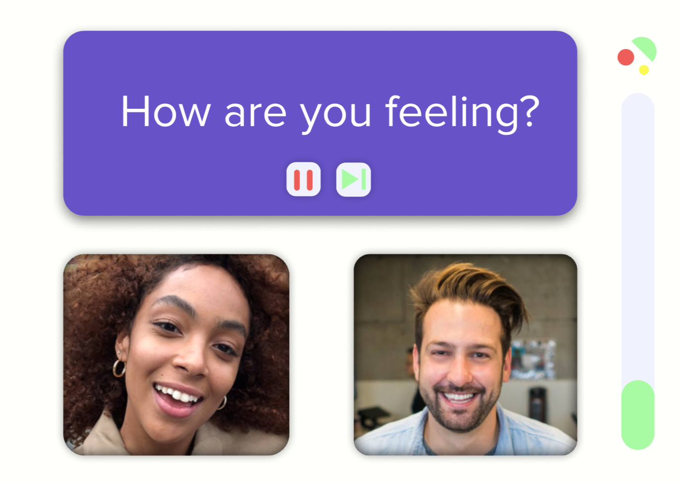
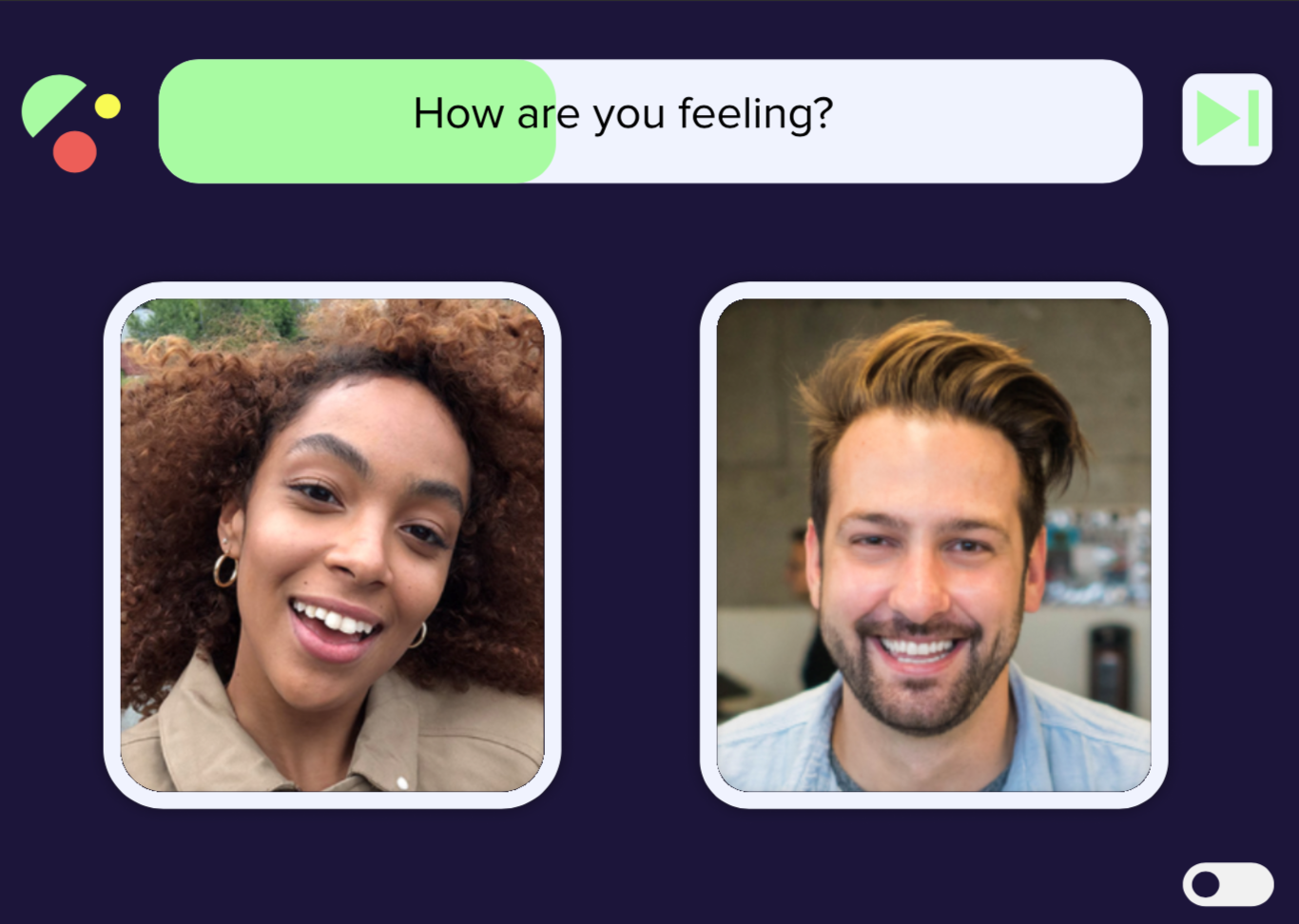
Wireframes and early concepts I generated for the team:
User Testing
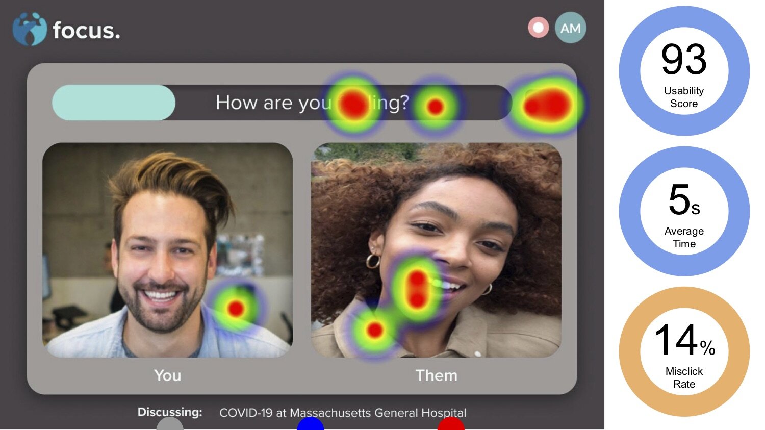
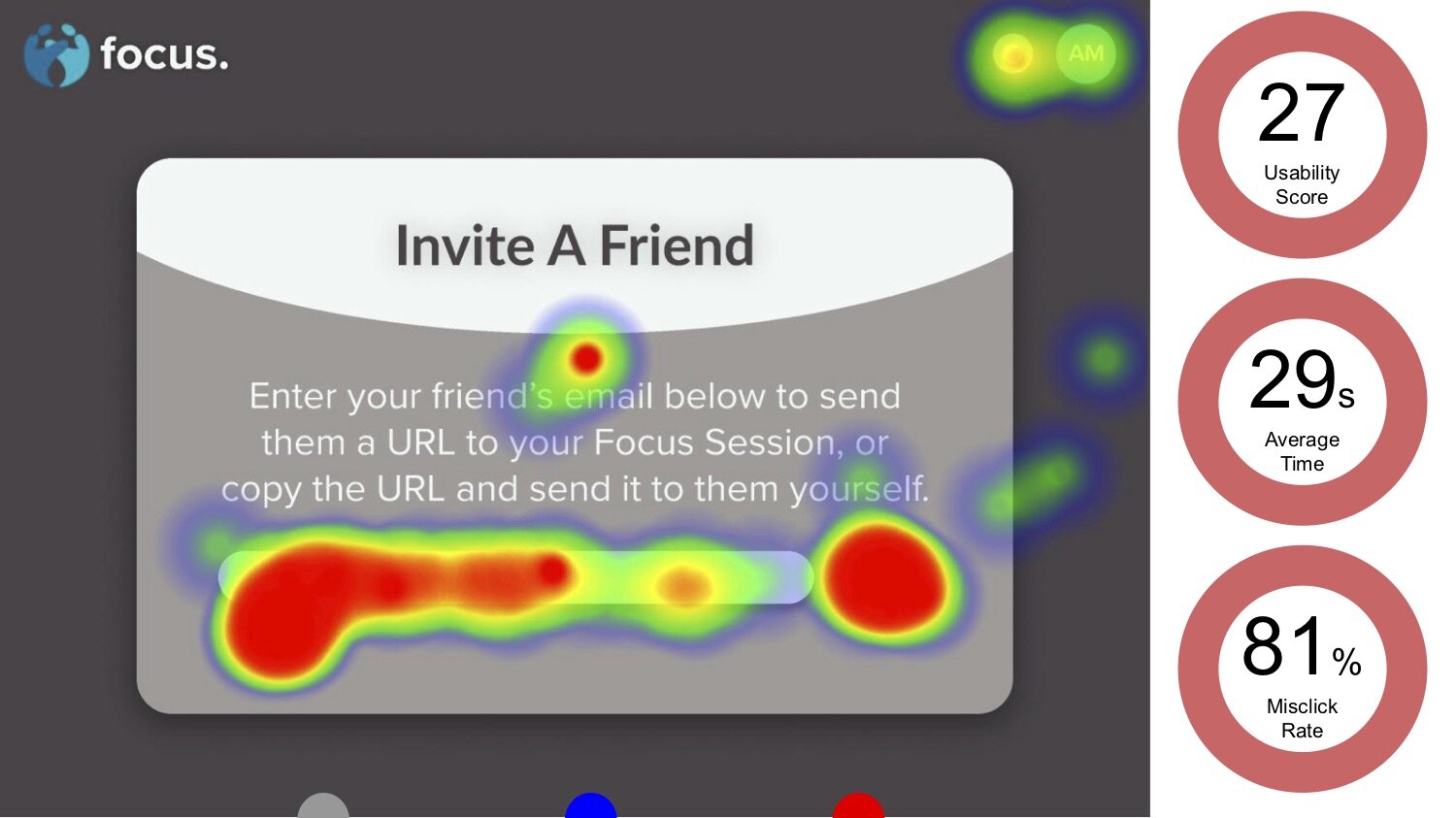
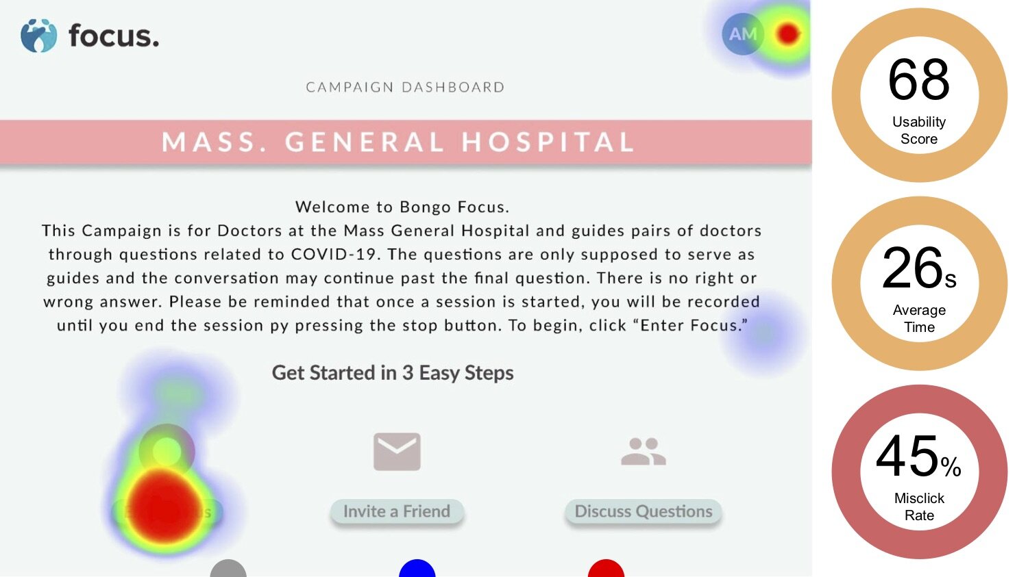
We did extensive research with developers, researchers and, most importantly, the users. We talked to many participants, of all ages and experiences with technology, so that we could design something functional and productive. We used the platform Maze to generate heat maps from our designs to better understand our mis-click rates and navigation times.
Final Designs
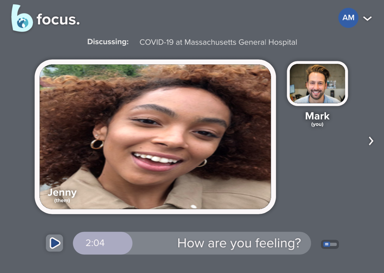
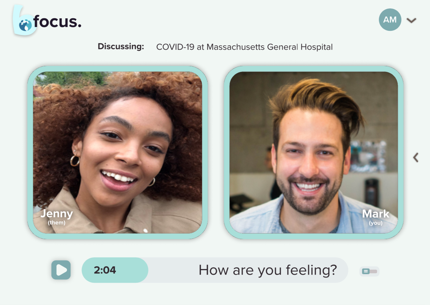
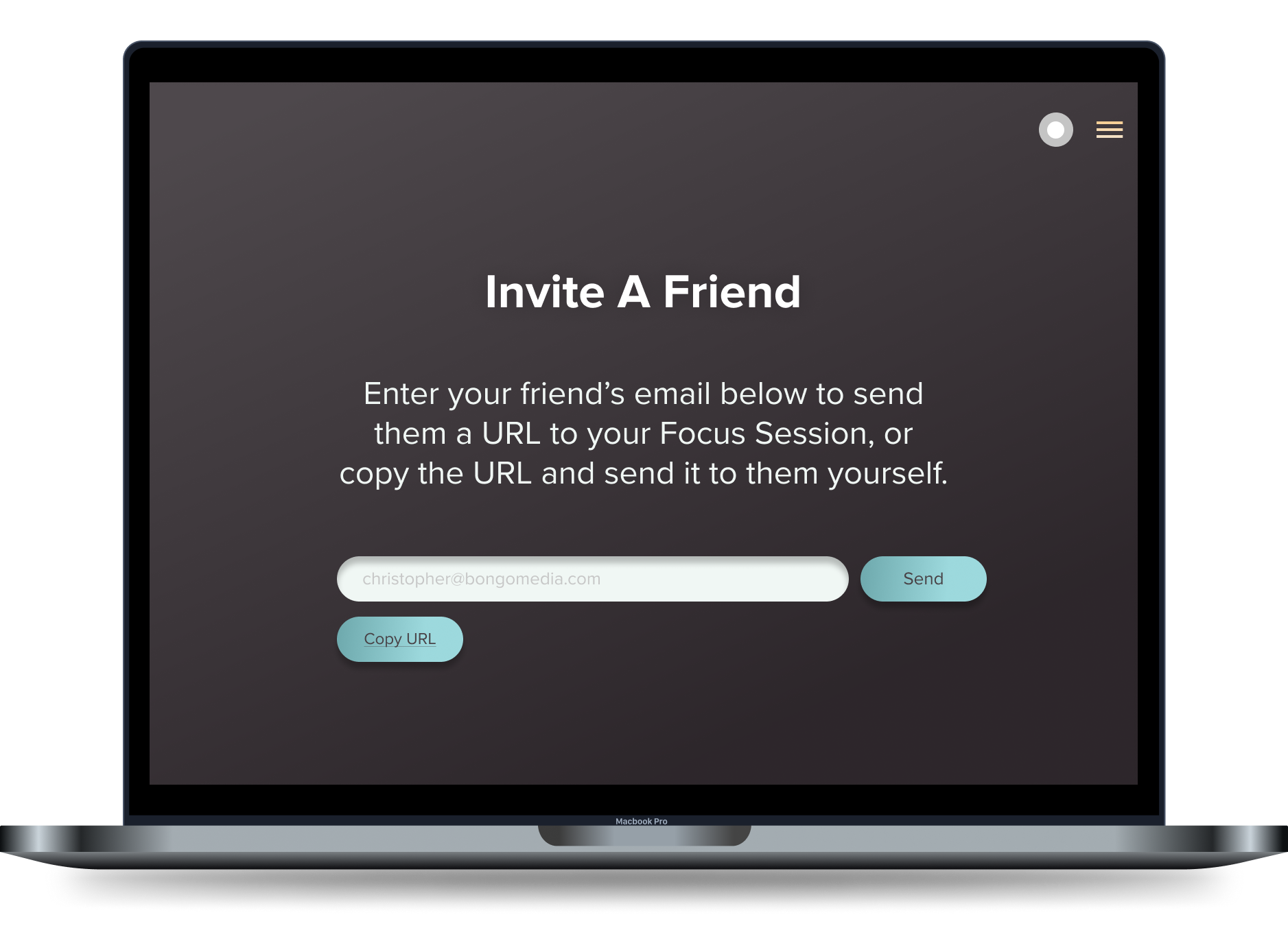
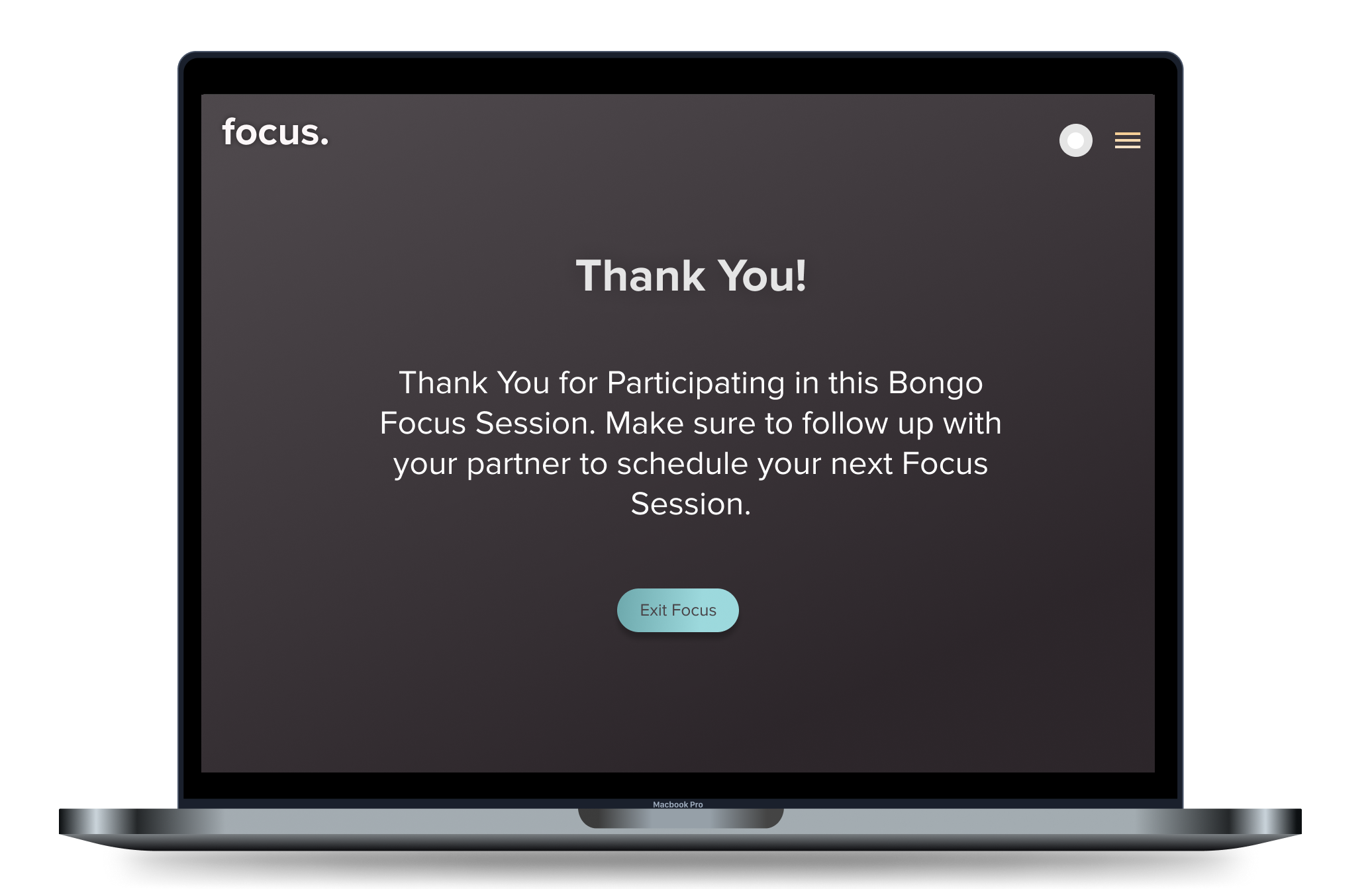
After iterations and collaborative design feedback, we came back and gave the app a fresh new look. We changed our color scheme to something more neutral and easier for users to navigate.


